Marketing dashboard redesign
The Problem
Marketing stakeholders at Ad-Market Company struggled to interpret campaign data due to overwhelming KPIs, poor hierarchy, and an outdated UI. The dashboard failed to support quick decision-making, resulting in confusion and time-consuming navigation.
My Role
Led UX Research (surveys + heuristic audit)
Designed information architecture
Created wireframes, UI layouts, and prototype flows
Delivered annotated Figma files for development
Tools Used
Figma, Miro, Google Forms, Notion
Goals
Improve information clarity and scannability
Prioritize key campaign metrics
Reduce friction in core tasks (campaign review, performance comparison)
Align design with SID’s brand evolution
Research Insights
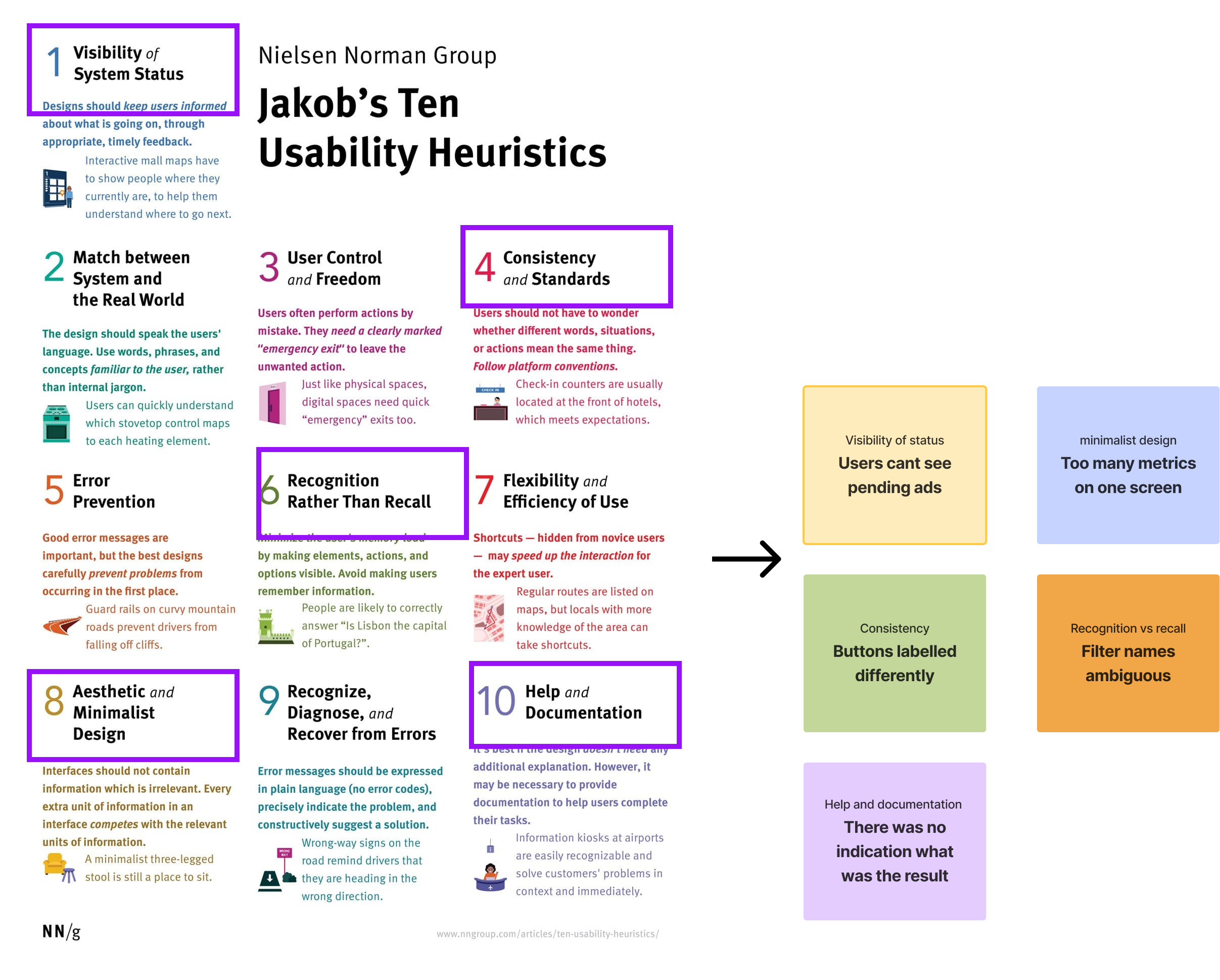
Heuristic Evaluation: Identified major violations in visibility, consistency, and flexibility.
Surveys: 70% of users felt “overwhelmed” by too many metrics.
User Interviews: Found users mostly checked only 3–4 KPIs regularly.
Key Insight: Users wanted fewer, clearer metrics and a streamlined view tailored to their workflow.
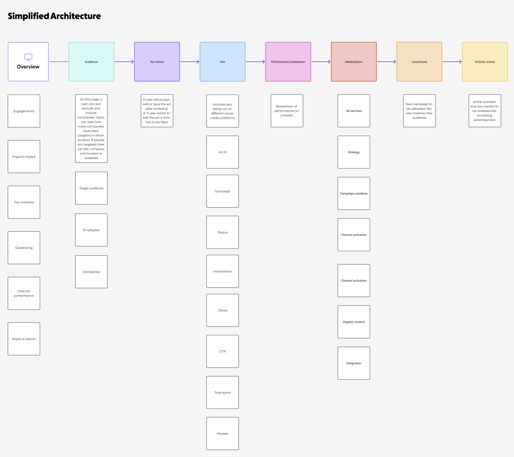
Design decisions
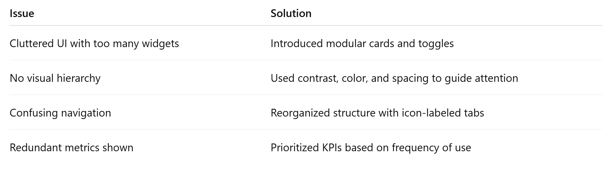
Old UI:
Metrics lacked grouping
Inconsistent data visualization
No customization
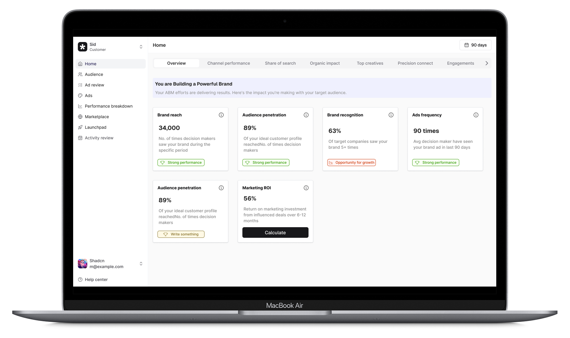
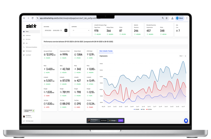
New UI:
Introduced tab-based navigation to segment workflows
Visual status indicators for ad approvals
Simplified KPI blocks with bold headlines and smart spacing
Toast components with 6px radius for clean micro-interactions
Outcome
50% faster task completion (observed in usability test)
3 out of 5 users rated the new flow “very intuitive”
Stakeholders noted improved readability and visual alignment with brand
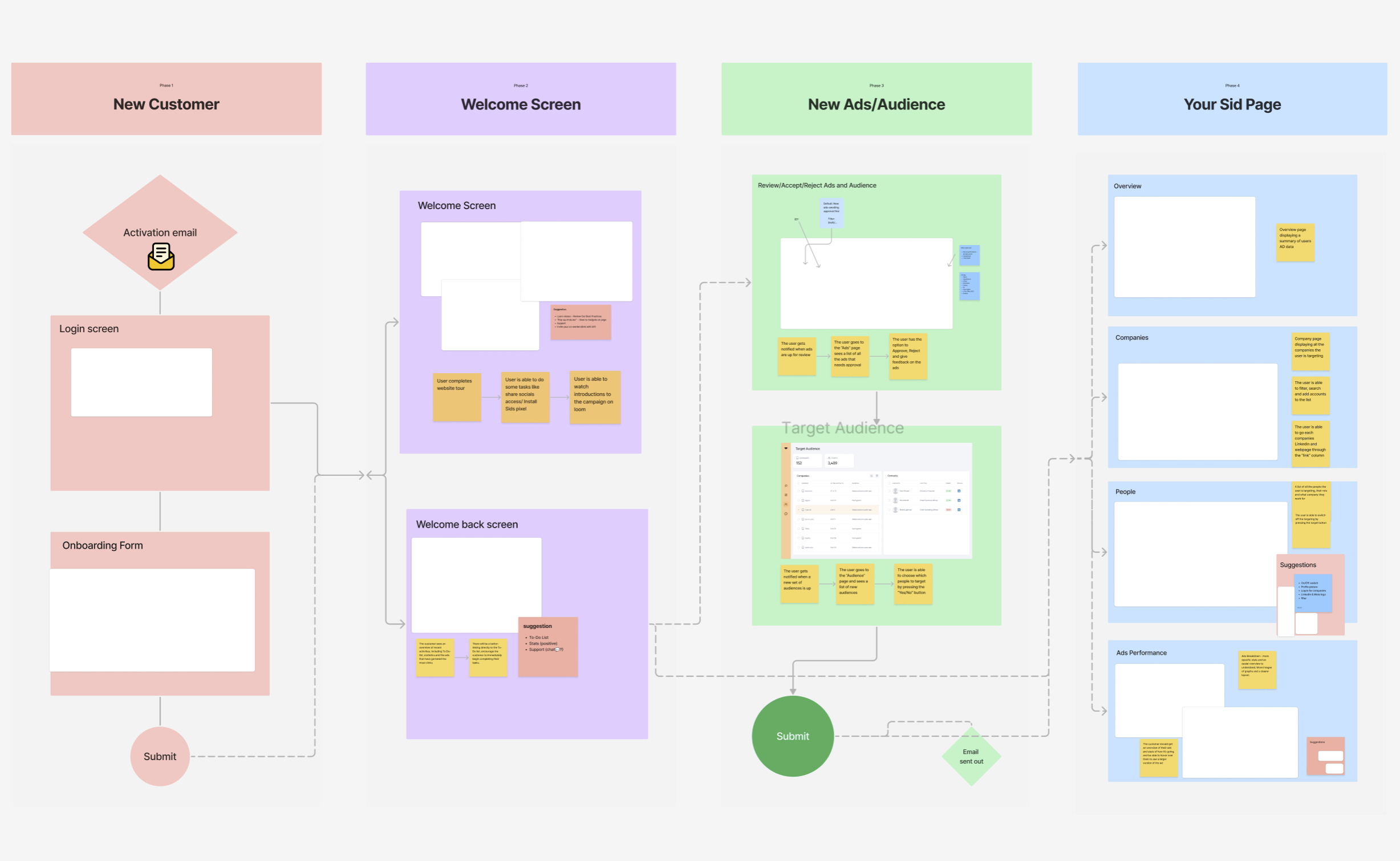
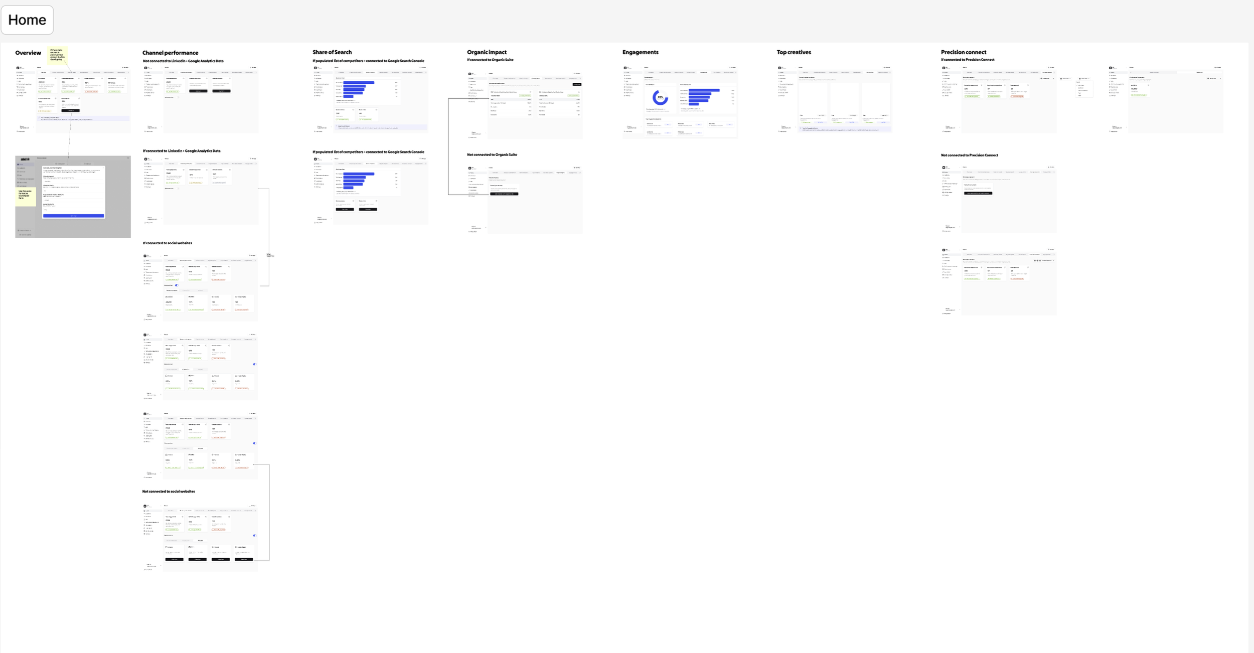
The groundwork
A sneak peak of the work that went behind redesigning.