Sid marketing dashboard redesign
Overview
SidMarketing is a B2B platform where marketing professionals review and approve ads, track campaign reach, and monitor brand recognition KPIs. The web app is built on JetAdmin, but its interface was cluttered and difficult to navigate, making it hard for users to clearly understand their tasks and outcomes.
The Challenge
No clear information hierarchy
KPI overload with little context
Poor navigation between sections
Unclear user journeys
UX Research
Heuristic Evaluation – Audited the existing UI using Nielsen's principles to identify usability issues.
Internal Interviews – Since I couldn’t access users directly, I spoke with the founder and internal team to understand workflows and pain points.
UX Survey – Sent to team members to rate clarity, usability, and flow. Results helped shape layout direction.
Wireframes – Created low-fidelity structures focusing on tabs, visual hierarchy, and action-driven layouts.
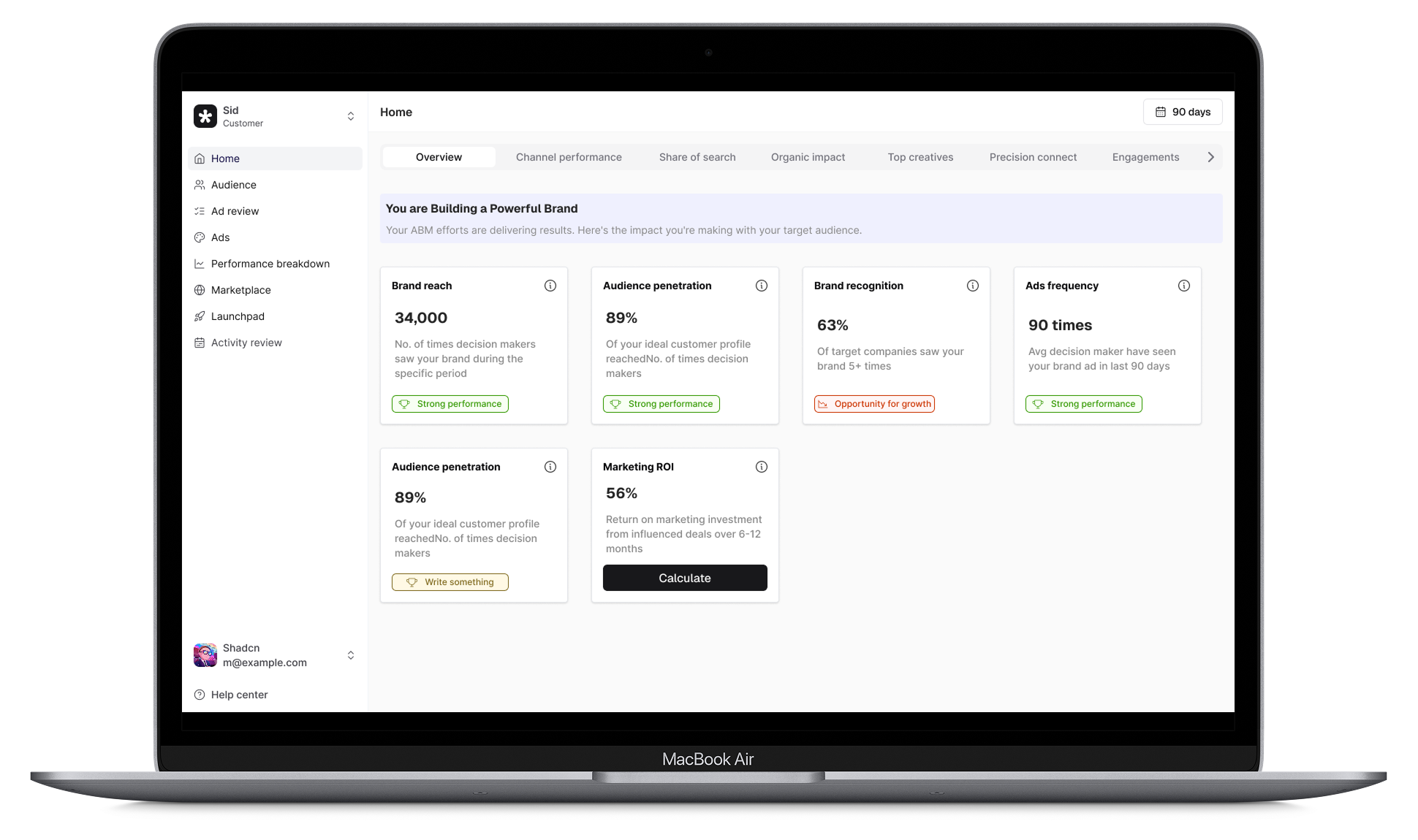
UI Redesign – Applied a clean black-and-white theme with grey accents. Designed modular cards, consistent components, and flexible tabbed navigation.
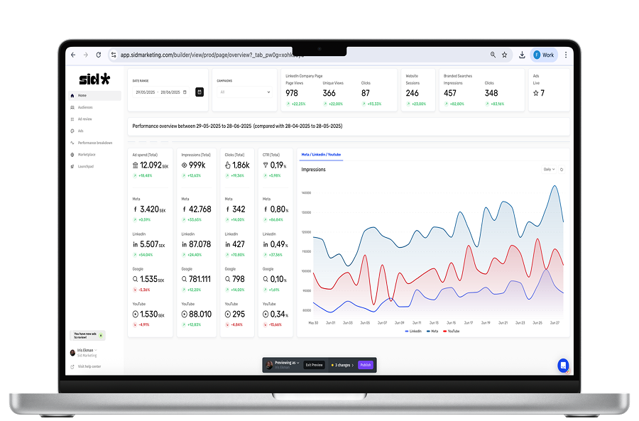
Old UI:
Scattered information without any results
Goals
Bring clarity and focus to user tasks
Align the interface with Account-Based Marketing (ABM) logic
Introduce modularity and design consistency for scaling
Make the dashboard demo- and customer-ready
Outcome
While the redesign is still in progress, early feedback has been positive. Team members report improved clarity, reduced overwhelm, and a stronger sense of structure. The interface now reflects the professionalism and focus SidMarketing aims to project.
Reflection
This project was a balance of product thinking, system design, and visual clarity. I leaned heavily on heuristic insights and stakeholder feedback, and created a scalable UI foundation for future growth.
New UI:
Introduced tab-based navigation to segment workflows
Visual status indicators for ad approvals
Simplified KPI blocks with bold headlines and smart spacing
Toast components with 6px radius for clean micro-interactions


